
CLIENT
City of Austin
ROLE
Project Manager,
UX Designer (1 of 5)
TIMELINE
Jan - Apr 2025
STATUS
Implementation
Overview
About Moped
The City of Austin custom-built Moped, an internal tool, to track the status of Austin's mobility projects (new bike lanes, sidewalks, traffic signals, etc) between departments and provide a map view of project locations and phases.

A screenshot of the current Project List page of Moped.
Problem
Moped wasn’t being adopted when pitched to new departments. Employees were struggling to understand Moped’s primary purpose, feeling it was an unnecessary tool that increased their workloads while not delivering additional value.
How might we highlight the purpose of Moped and strengthen its value for employees?
Solution
My team and I focused on improving Moped’s information visibility, search competency, and efficiency. We also introduced the idea of user customization, to allow different departments to fine tune the software to meet their needs.

Track important projects
With the new dashboard.
Saving repeatedly used filters, see the active phase of all your projects at a glance, and enjoy quick access to all of your most important projects in a single table.

Speed up searches
With the new quick filters.
Use your saved filters, make advanced filters, quickly check boxes to add basic filters, and create the exact search combinations you need to find your project(s). Pin the filters you use the most for even faster access!

Get more info at a glance
With the new Project Map tab.
The new map now maintains the same tab navigation, shows all component information up front, and color codes based on component phases with no further clicks or menus required. Use the new settings menu to refine down to only the information you need to see!
The Design Process
01
Plan
-
Moped’s goals
-
Project constraints
-
Project plan
02
Research
-
Competitor analysis
-
Interviews
-
Design goals
03
Design & Test
-
Low-Mid fidelity
-
Usability test I
-
High fidelity
-
Usability test II
01 | Plan
Moped's Goals
-
Improving the consistency of the UI and in-app navigation
-
Refining map view functionality
-
Increasing the visibility of help documentation
Project Constraints
Our client asked that we only use Google's Material UI for final designs. We also needed to consolidate research into as few sessions as possible, and had no access to tools other than Moped, making it a challenge to learn where Moped fit into employee's daily workflows.
Project Plan
I began by creating a Gantt chart for a visual overview of the project plan. Managing a team of 4 other designers over 14 weeks meant it was critical to have a robust project plan, with enough flexibility to accommodate unexpected holdups.

The project plan in Gantt chart format, created using FigJam.
02 | Research
Competitive Analysis
I focused on spatial project tracking software, like OpenData and ArcGIS, to see how they presented project data. My teammate focused on project management apps like Asana, Monday, and Jira, to learn what mechanics were successful for tracking.
Easy to access + filter
Quickly find projects of interest
-
Open Data: fast filters and sorting
-
Monday: searching Workspaces
-
Jira: advanced search and filtration, including within projects
-
Asana: quick project access in a dedicated left hand toolbar
-
ArcGIS: in-depth filtering, top level tabs, search, and geospatial filters
Customizable
Hide and show relevant data
-
Monday: customizable dashboard and project layouts via widgets, tables, cards, etc
-
Jira: addable pages for individual projects
-
Asana: customizable cards on dashboards, including project-level
Hierarchical
Favoriting important items
-
Monday: favorite Workspaces and task prioritization
-
Jira: starred Workspaces
-
Asana: starred Workspaces, and task priority and severity
-
ArcGIS: ability to favorite datasets
User Interviews
I recruited City of Austin employees for 45 minute exploratory interviews, conducting 3 out of 10 interviews. The goal was to learn how Moped was being used, its context in larger workflows, and what user goals and frustrations were.
The main findings were that users:
-
Did not have faith in the accuracy of data in Moped
-
Lacked a consensus on the purpose of Moped
-
Felt there was a lack of documentation and training
"We’re not able to use Moped as much as we could, because it's difficult to tell the whole story. The pieces of info are disconnected."
– City of Austin employee
Design Goals
My teammates ran an ideation workshop to create a series of findings, insights, how might we questions, and a series of design goals that bridged our findings with the City of Austin's goals.
03 | Design & Test
Low-Mid Fidelity
Everyone on the team drafted low fidelity ideations for the various screens, and dot voted on our favorite concepts. I was responsible for combining the group's favorite concepts into a cohesive set of mid fidelity wireframes take into usability testing.
.png)
The mid fidelity wireframes used for the first round of usability testing.
Usability Test I
Our first round of usability testing asked users to complete the same tasks using both the existing Moped designs and our redesigns, to learn where users were getting stuck or frustrated and if our redesigns were addressing those issues.
Our top findings included:
High Fidelity
To address these findings, I added a dedicated activity log and map view card to the dashboard, and the ability to collapsible and pin filters in the project list.

The high fidelity wireframes used for the second round of usability testing.
Usability Test II
My team then conducted a second round of usability testing using the high fidelity prototypes, which had limited interactivity in place. Users felt we were headed in a good direction, but there were several issues that needed to be addressed:
Challenges
Dashboard Map Card
From the beginning, users had been asking for a map view on the Dashboard. My original designs had a tab to switch to map view, but it wasn't visible enough.

The original mid fidelity dashboard, with the tab to switch between list and map view.
My team discussed adding a small dedicated map card, but I was concerned about the interaction design behind it. I designed a compromise that prioritized the activity log instead, but still contained a mini map. The group agreed to try it out.

The compromise card design that prioritized the activity log but still included a map.
During testing, users said the new card was too busy, and most were still asking for a dashboard map. I realized that I had become so concerned about what would be easier for me to design that I had forgotten the most important thing...
I am not the user.
And the users had been asking for a map on their dashboard.
The final designs included a prominent, simple dashboard mini map. There wasn't much functionality to it, just the ability to filter by project type and zoom in to see color coded project status, but it ended up being one of the most positively received features by stakeholders.

The final high fidelity dashboard presented to stakeholders.
Project Relationships
During our final round of testing, it was revealed that I had misunderstood how related projects worked. I learned that a project can only have either a Parent Project or a Subproject, not both (as I had assumed). With only a few days to rectify this, I quickly drafted up iterations and discussed with my team. With their approval, I was able to swap in the approved iteration in time for our final presentation. Phew!


The before (left) design, when I had misunderstood the feature vs the after design (right, highlighted) when I revisited the concept.
Final Designs
Dashboard
The redesigned dashboard has cards to visually separate different functions. Users can now save and edit groups of filters and see a map overview of their projects.

The original Moped dashboard (left) and the final redesigned dashboard (right).
Project List
The redesigned project list includes a new quick filter menu, where users can select saved filters, craft their own advanced filters, and pin important filters. The main table includes a shortcut to quickly bookmark projects to the dashboard.
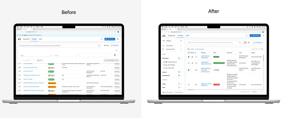
The original Moped project list (left) and the final redesigned project list (right).
Project Map Tab
The redesigned map tab for projects preserves the location of the navigation tabs instead of opening in full screen. The component list shows more information by default and has a settings menu where users can decide the information they want. The map shows labels, phase colors, and a stronger indicator of current selection.

The original Moped map tab for projects (left) and the final redesigned map tab (right).
Reflections
Skills Learned
-
Project Management – I learned when to have faith in my team and not get involved
-
Google's Material UI (MUI) – I learned to navigate an existing design system, and annotate for future use
-
Stakeholder Communication – I learned to deliver consistent, concise communication to stakeholders
